Spannerhead Dot ComSpannerhead.com

Posts filed under ‘Aesthetics’

Styling Misfires: The ’04-’06 Pontiac GTO

March 18, 2013 by Matt

2004 Pontiac GTO Red

It could have been great. Really.

Arriving in showrooms a year before Ford’s acclaimed Mustang reboot in 2005, the 2004-2006 Pontiac GTO had a real chance to vault past its eventual competitors, including the Chevy Camaro and Dodge Challenger, as the first of a new generation of muscle cars. Pontiac’s “GTO” nameplate has volumes of automotive history and lore to draw from, aesthetically and philosophically, and the platform chosen for the new car was GM Australian subsidiary Holden’s excellent Monaro sports GT.

2004 Pontiac GTO Red

Such potential…such failure. The GTO never even approached GM’s sales expectations and lingered in showrooms for a few lonely years before being quietly euthanized. What happened?

To put it mildly, the enthusiast community was underwhelmed. I pin the vast majority of the blame on the looks. It really is hard to fault the combination of a GM pushrod V8, RWD chassis, 6-speed manual transmission and competent suspension tuning. All reviews of the day noted that although the dynamics of the car lacked the ultimate polish of the GTO’s European rivals, they were exemplary for an American car, and for Pontiac especially, who, as noted in the recent post on the equally ill-fated G8 sports sedan, had been forced for years to convince the buying public that warmed-over, badge-engineered FWD family sedans were the last word in “performance.” Finally, finally, they received a platform with all the mechanical organs in the right places, and…the styling deep-sixed the car’s chances before the enthusiast community even entered the showroom.

It’s not that the GTO is an ugly car—it’s not—it’s just… Utterly anonymous-looking. Plastic. Jellybean-like. It could have been the 2-door version of a contemporary FWD Pontiac family sedan and no one would have been the wiser. It did not mine any classic GTO design themes or cues, and its innocuous aesthetics were completely at odds with any kind of rip-snorting “bad boy” muscle car feel its chassis tried to convey.

2006 Pontiac GTO Silver

For its last two model years in 2005 and 2006, Pontiac attempted to “beef up” the car’s visual flair with a pair of hood scoops and true dual exhaust tips, among a handful of other detail changes, but it was too little, too late, and anyway the changes didn’t alter the GTO’s fundamental styling shortcomings. Pity; there was so much goodness under the skin.

Image credits: netcarshow.com

Editor’s note: This post is part of an ongoing series wherein we discuss unsuccessful cars whose styling was their overlooked (or denied) Achilles heel. Read the other installments here:

3 Comments on Styling Misfires: The ’04-’06 Pontiac GTO

Audi Concepts: The TTS

March 8, 2013 by Matt

Audi TTS Concept Gray

Whatever your thoughts about the production version (too cute, not a real sports car, etc), there’s no denying Audi’s initial TTS Concept, unveiled in 1995, was groundbreaking.

Let me explain. The TTS Concept is an exercise in context—every single styling feature has meticulously thought-out relationships with the ones surrounding it, and the overall result is an incredibly cohesive-looking vehicle. Most significantly, Audi gave the car’s wheels a context—notice how the curve of the front and rear of the car neatly echoes the circular arc of the wheels. This has the effect of integrating the wheels more closely into the TTS’ overall look.

Audi TTS Concept Gray Rear Back Taillights

Big deal, you say; cars have had wheel arches and fender flares for ages. True, but to my knowledge the TTS was the first car to have such a tight connection between its wheel design and placement. Consider: If you changed the average car’s wheelbase by an inch or so in either direction, it would hardly alter the car’s look, but with the TTS, the wheels are located precisely where they are because of how they relate to the car’s front and rear styling; any change in their location would wreck the design.

Audi TTS Concept Interior Inside Cockpit Console Dash Dashboard

With its chunky “baseball glove” stitching mated to clean, geometric shapes, the interior is a home run as well. Some elements didn’t survive the transition to production, primarily the aforementioned stitching, the gauge typography and the raw aluminum door bars, but Audi wisely kept most everything else intact. Between the color combination (chocolate leather and battleship gray paint), meaty switchgear and a perfectly laid out control arrangement, the TTS’ interior looks like a very inviting place to be.

Audi TTS Concept Interior Inside Cockpit Console Dash Dashboard

I think what I appreciate most about the TTS Concept is its fusion of the beautiful with the rational. Every single line, curve and feature seems designed and placed with a definite sense of purpose; it’s the antithesis of the “Well, it just looks right” school of design. No, the best styling efforts have thought and intentionality behind them, and that design creedo shines through the TTS Concept.

Image credits: fourtitude.com

Editor’s note: This post is part of an ongoing series discussing Audi’s rich history of legendary concept cars. Read the other installments here:

1 Comment on Audi Concepts: The TTS

Design Showdown:
McLaren P1 vs. LaFerrari

March 6, 2013 by Matt

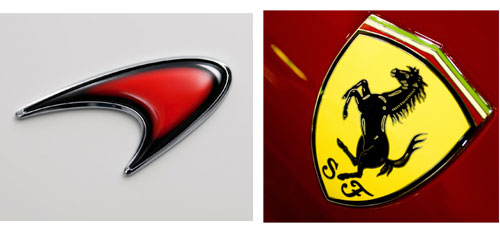
McLaren Ferrari Logos

In anticipation of their reveal at the upcoming 2013 Geneva Motor Show, the automotive world is abuzz with talk of the latest offerings from perennial Formula 1 and road-going supercar rivals McLaren and Ferrari.

You can read more about their staggering technical specs here; for now, let’s examine them from a design standpoint and weigh in on which one is more aesthetically successful, or, to tip my hand a bit, which one is less ugly.

Our first contender is McLaren’s so-called F1 successor, the P1. Sinewy and organic, the eyebrow-like McLaren logo is echoed in many places throughout the bodywork. Like its little brother the MP4-12C, though, the P1 manages to look dramatic and somewhat anonymous at the same time. Its lines don’t strike me as being particularly resolved, and as such the whole car has a nervous, fragile, unsettled look about it.

McLaren P1 Yellow

McLaren P1 Yellow

McLaren P1 Interior Inside Cockpit Console Dash Dashboard

Next up is the brand new follow-on to the Enzo, the ridiculously-named Ferrari LaFerrari. Unveiled in the past couple of days, the LaFerrari certainly looks more conventional than its British competitor. Still, the black roof and stock supercar proportions combine to make it look like a cutting-edge supercar for, say, 1994.

Ferrari LaFerrari Red

Ferrari LaFerrari Red

Ferrari LaFerrari Interior Inside Cockpit Console Dash Dashboard

On the merits of its styling, which do you prefer? I honestly can’t pick a favorite. I appreciate the creativity of the P1, but the LaFerrari’s lines are more resolved overall. Until an automaker can pen a supercar design at once fresh-looking, well-proportioned, with exquisite detailing and above all, beautiful—yes, I do believe it can be done—I don’t know that I will have a dog the burgeoning supercar fight, a conflict that includes not only the cars featured in this post, but offerings from Porsche, Pagani and Lamborghini as well.

Image credits: netcarshow.com

2 Comments on Design Showdown:
McLaren P1 vs. LaFerrari

Styling Faux Pas: Giant Logos

February 6, 2013 by Matt

Infiniti FX Logo Badge Emblem

This unfortunate trend seems to be especially virulent among Japanese firms, notably Infiniti, Mazda, Lexus and Honda.

It’s hard to grasp how large these logos really are except by viewing them in person. They’re honestly close to saucer-sized.

Honda Odyssey Logo Badge Emblem

There are a couple of theories as to the cause of the trend. One is a recognition of the fact that many Japanese cars share very similar and bland styling and their automakers want to distinguish them from their peers by way of branding instead of rest-of-car design. Also, it could be that there’s a trend toward larger grilles in general, and thus logos must grow in size proportionately.

Lexus CT200h Logo Badge Emblem

Lexus has indisputably been the worst offender lately, having seemingly fallen completely into the “make the logo bigger” upper-management mindset that drives designers, like myself, nuts. Not only that, in contrast to the other automakers’ good sense in reserving the larger logo for, oh, their larger cars, Lexus seems to take great pleasure in slapping the massive emblem on even their entry-level models, like the CT200h shown above. Furthermore, the automaker’s logo isn’t the most attractive, smacking of a corporate focus-group development process; more detailing within the logo itself (think Porsche or Cadillac) might make it work better.

Here’s hoping this tacky trend peters out rapidly.

Image credits: netcarshow.com

Editor’s note: This post is part of an ongoing series highlighting automotive styling missteps. Read the other installments here:
5 Comments on Styling Faux Pas: Giant Logos

2014 Lexus IS: A Design Analysis

February 4, 2013 by Matt

2014 Lexus IS Sedan

The problem here is context.

The details of the next generation Lexus entry-level sports sedan, the IS, are certainly generating a buzz. Next to the C7 Corvette, it’s been arguably the most aesthetically dissected car to emerge from the recent 2013 Detroit Auto Show.

The reviews haven’t been overwhelmingly positive. The consensus seems to be that although observers appreciate the fact that Lexus is taking chances, design-wise, the new IS’s shape leaves them unsatisfied. Personally, I want to like the new “spindle grille” motif the Japanese luxury automaker has cooked up, but somehow it just doesn’t sit right; I respect aesthetic risk-taking, but between the grille and the new taillights (the new IS’s two most prominent features), I’m left feeling…uneasy as I contemplate the new car’s lines.

The nose. Evident in the picture at top, the nose is far and away the most prominent feature of the new car. An attempt to create “visual tension” by giving the impression the bodywork is stretched tightly over some muscular internal structure, the feature falls flat simply because none of the rest of the car matches its design drama. Put your hand over the new Lexus’s fascia and the car becomes another run-of-the-mill sports sedan. It’s the aesthetic equivalent of a stage actor turning in a powerhouse performance…while his castmates phone in their lines. There’s just no visual support from the rest of the car.

2014 Lexus IS Sedan

The tail. Slightly more successful is the 2014 IS’s other “showcase” styling element, its downward-sloping taillights. By visually connecting the taillights and the rocker panels, the rear wheels and thus the car’s RWD configuration are emphasized. So far, so good. But there remain two major problems: The styling effect employed makes it look like the bodywork is tearing or breaking so that the taillights can push through, giving them a sort of half-finished look, and their taper around the side of the car leads the observer’s eye forward back onto the car’s flanks, when the tail should be a smooth resolution and neat conclusion of the car’s look. As it is, our eyes are constantly thrown back toward the IS’s profile, kept in a kind of awkward visual limbo.

2014 Lexus IS Sedan

The proportions. The new Lexus’s context problems are on full display here. There’s nothing in the car’s proportions that even comes close to the impact of the car’s extremities. Really the only update over the previous generation is a lower decklid, reintroducing a traditional bit of “three box” styling into the new IS’s profile, but otherwise… Ho hum.

2014 Lexus IS Interior Inside Cockpit Console Dash Dashboard

The interior. For its part, the interior is serious and tasteful with a strong sense of structure. Taken in isolation, it’s quite well done…but then you remember what the outside, and particularly the nose of the car, looks like, and scratch your head that there could be such a marked difference in feel between the two areas.

I wonder how isolated the design teams working on different parts of the car were from each other? From the looks of it, they must’ve had minimal, if any, contact with each other prior to applying their efforts to the new Lexus’s basic shape. There are lots of good ideas here, just no cohesion. Maybe next time.

Image credits: netcarshow.com

No Comments on 2014 Lexus IS: A Design Analysis

Audi Concepts: The Rosemeyer

January 25, 2013 by Matt

Audi Rosemeyer Concept Car

I honestly wasn’t sure what to make of this one when I first saw it.

Audi’s Rosemeyer concept, one of the highlights of the 2000 auto show circuit, certainly isn’t a conventionally beautiful car. It is, however, fascinating in the sense that when I first beheld it, I was immediately curious about its design influences; I wanted to know why Audi had decided to shape its lines and details how they did, and even the genesis of its name. There had to be a lineage, a reason—Audi is too deliberate a car company to pen such a car on a whim.

Audi Rosemeyer Concept Car

In a nutshell, the Rosemeyer concept is Audi’s homage to the all-conquering
1934-1939 “Silver Arrows” Grand Prix racers. This crop of pre-war German monsters, fitted with massive, supercharged engines channeling, in the end, well over 600 hp through the skinny tires of the era were only truly mastered by a handful of top tier drivers, among them Rudolf Caracciola, Tazio Nuvolari and the concept’s namesake, Bernd Rosemeyer, killed during a land speed record attempt in 1938 on the then-brand-new Autobahn.

Audi Rosemeyer Concept Car

Audi Rosemeyer Concept Car Inside Interior Cockpit Console Dash Dashboard

The Rosemeyer exudes a brutish, imposing, almost industrial presence. The brushed aluminum finish is catnip to a design enthusiast and the almost Art Deco features like the headlight eyebrows and four-spoke steering wheel make it look like something out of Fritz Lang’s landmark sci-fi epic Metropolis. Every line is rational, crisp, utterly Bauhaus, not classically lovely but completely mesmerizing. In a way, it reminds me of a Porsche 911 in the sense that if described objectively, someone not able to observe the car wouldn’t visualize a beautiful vehicle, but actually seen, everything works together perfectly; no detail seems to have been overlooked.

Audi Rosemeyer Concept Car

Furthermore, its shape whetted our appetite for that of the Bugatti Veyron. Even a casual comparison of the two brings out their similarities: The relatively small greenhouse, the horse-collar grille, the same general stance and proportions; they even share a mid-mounted W16 engine configuration (the Veyron’s fitted with quad turbochargers) and all-wheel-drive. But where the Veyron shares little with its marque’s predecessors save its grille shape, the Rosemeyer’s design connects with Audi’s lineage at too many points to count. I’d call it the superior design, and it’s a shame its creator declined to produce it, citing potential brand conflicts with Lamborghini, which Audi had recently purchased, as well as difficultly in translating the design into a production form at a certain price point.

Image credits: fourtitude.com

Editor’s note: This post is part of an ongoing series discussing Audi’s rich history of legendary concept cars. Read the other installments here:

2 Comments on Audi Concepts: The Rosemeyer

Styling Faux Pas: Chrome Noses

January 21, 2013 by Matt

Acura MDX Nose Front Fascia

Today we begin a new series spotlighting ill-conceived design trends, styling decisions that provoked more than their fair share of head scratching and features that turned out just plain ugly. Think of it as a repository for all those little mental “design notes” I file away as I observe the cars around me on my commute.

Designers have a number of “hail marys” they can throw when unable to successfully resolve the lines on a particular area of the car, but perhaps none is so obvious as the classic technique of just loading up the region with chrome.

Ford Fusion Nose Front Fascia

Visualize any of the cars in this article with color-keyed bodywork in place of the chrome. What happens? The fascias of the cars become boring, uninteresting, dull, evidence that the contours and lines—the car’s visual bedrock—weren’t successful enough to stand on their own, without the “enhancement” of the shiny stuff.

VW Jetta Nose Front Fascia

For the record, I have no problem with chrome in general—when applied in a restrained, tasteful manner that supplements the car’s proportions and shapes, rather than becoming the main attraction (or detraction). As it is, with the examples shown, among others, there’s more frosting than cake.

5 Comments on Styling Faux Pas: Chrome Noses

Showstopper:
Hyundai HCD-14 Genesis Concept

January 18, 2013 by Matt

Hyundai HCD-14 Genesis Concept Detroit Auto Show 2013 Gray

Well, it should have been the main attraction at the 2013 Detroit Auto Show, rather than that vulgar, glitzy, warmed-over American icon that hogged all the publicity.

This is the first time in over a year and a half that this blog has highlighted a vehicle made by the South Korean giant, but with their HCD-14 Genesis Concept, they’ve earned some attention. A fascinating blend of American, British, German and Asian design themes, the HCD-14 takes styling cues from many different sources and fuses them into something that stands confidently on its own four tires.

Hyundai HCD-14 Genesis Concept Detroit Auto Show 2013 Gray

The influences are obvious. The nose treatment and return on the back edge of the rear window are lifted from Aston Martin and the slope of the decklid very much resembles that of Audi’s gorgeous A7. Furthermore, most of the (few) chrome details draw from Asian design history and the whole car’s slab-sided “pillbox” proportions pay homage to classic American cruisers like late-’40s Hudsons and Buicks and more recently, cars like the Chrysler 300.

Hyundai HCD-14 Genesis Concept Detroit Auto Show 2013 Gray

All that said, the HCD-14 creates an identity beyond the pastiche of influences by virtue of its emphasis on proportion over decoration (a common refrain around here), an achievement remarkable given the incredibly overwrought and at times head-scratching designs Hyundai has produced lately. It’s distinctive without being tacky, and exaggerated enough, in classic show car fashion, such that elements like the front end design and overall shape would hit the bullseye if toned down just enough for the production line.

Hyundai HCD-14 Genesis Concept Detroit Auto Show 2013 Interior Inside Cockpit Console Dash Dashboard

For its part, the interior fails to break any new conceptual ground, but is understated (for a concept car) and quite inviting-looking, with themes that could translate easily to a road car.

Hyundai HCD-14 Genesis Concept Detroit Auto Show 2013 Interior Inside

Most significantly for Hyundai’s future design direction, the HCD-14 features a number of elements that could be easily incorporated into cars of different sizes and proportions, in the same way that BMW’s signature kidneys are versatile enough mesh with a variety of bodystyles. Take the simple, near-vertical grille shape and the way the inside apexes of the headlights relate to its upper corners—that design detail is very “portable” in the sense that, say, a sports car’s low, rakish shape could feature headlights of nearly the same shape paired with a similar, but lower and wider grille. The family resemblance would be present, and the sports car’s styling wouldn’t be compromised by having to graft an out-of-context “corporate identity” onto the fascia. The HCD-14’s shapes and details represent the first real, golden opportunity for Hyundai to build a long-term brand image. For that reason, among others, it’s a true standout.

3 Comments on Showstopper:
Hyundai HCD-14 Genesis Concept

Underrated Lookers: The Mazda CX-7

January 2, 2013 by Matt

Mazda CX-7 CX7 Red

After 6 years, we hardly knew ye.

Among the dozen or so cars departing the US market for the 2013 model year include the Mazda CX-7, the automaker’s first attempt at a midsize crossover SUV.

Normally I don’t devote much (any?) blog space to anything remotely SUV-ish, but as a devoted fan of the brand in general and admittedly, the CX-7 in particular, I thought I’d give it a farewell look. There aren’t many vehicles of an SUV-like nature I’d actually consider for daily driver duty, but Mazda’s outgoing midsize ute is one of them.

Mazda CX-7 CX7 Silver Rear Back

Offered starting in the 2007 model year, the CX-7 and to a lesser degree its bigger near-twin the CX-9 never really caught on. Reasons include the turbocharged 2.3l, 244-hp 4-cylinder’s relatively poor fuel economy (an important consideration in the car’s class), sub-par name recognition (no one really goes to Mazda looking for a midsize crossover) and interior space compromised by the CX-7’s styling.

Mazda CX-7 CX7 Interior Inside Cockpit Console Dash Dashboard

A word on the styling: To my eyes, as crossover SUV’s go, it’s fantastic. It communicates Mazda’s fun-to-drive philosophy exceedingly well using SUV proportions, and looks far less generic and much more cohesive than anything else in its class (contrast the utterly anodyne shapes of the Hyundai Santa Fe or Toyota Highlander for reference). No, Mazda attempted something more ambitious, shape-wise, than its rivals, creating a kind of capable-looking urban jungle transport capsule, and succeeded in crafting a design at once accessible and futuristic. 20 years ago, looking at the concept car landscape, didn’t we all think we’d be driving cars with overtones of the CX-7? I did.

Couple the winning design with a dose of Mazda’s traditional dynamic excellence (such as it can be on something with a CG so high), and it’s a true shame the CX-7 is leaving the market.

Editor’s note: This post is part of an ongoing series featuring cars whose design I find appealing, in contrast to mainstream opinion. Read the other installments here:

2 Comments on Underrated Lookers: The Mazda CX-7