Spannerhead Dot ComSpannerhead.com

Posts filed under ‘Aesthetics’

The New BMW 4-Series Concept:
A Design Analysis

December 19, 2012 by Matt

BMW F32 4-series 428i 435i concept silver design styling

As we did with the design of the 4-door version of this car, the recently-released F30 3-series, let’s put the styling of the upcoming F32 4-series under the microscope. Granted, this car is officially billed as a concept, but considering BMW pulled the same thing a year or two ago with a “6-series concept” that ended up looking exactly like the production car, it’s fairly safe to say this is BMW’s new bread-and-butter 2-door.

So as sorely as I’m tempted, I’ll refrain from ranting about BMW’s absorption of the numeral “4” into their incredibly convoluted nomenclature system, and simply focus on the aesthetics:

BMW F32 4-series 428i 435i concept silver design styling profile side proportions

The proportions. There’s a lot to like here. BMWs have long excelled in this area, and if I had one bone to pick with the otherwise lovely outgoing E92 3-series coupe, it was a manifestation of BMW’s capitulation to the “swept back” fascia profile, where the bumper is smoothly integrated into the grille area and the signature kidneys sweep back into the hood. This was at odds with the Bavarian automaker’s traditionally upright, forward-swept nose profile, and the 4-series concept restores that classic look, to excellent effect. Additional noteworthy elements include the front wheels pushed well forward to emphasize the car’s handling prowess and the nicely-sculpted rocker panel that reduces the profile’s visual height.

It’s been said the 4-series seems to crib a lot from Audi’s A5 coupe in profile, but regardless if that statement’s truth value, if you’re going to raid design themes from another automaker, stealing from the A5 shows excellent taste on the part of the thief.

BMW F32 4-series 428i 435i concept silver design styling rear back tail

The details. The 4-series concept’s details are somewhat less successful. The front and rear valences are essentially mirror images of each other, and while they’re nicely-tailored and aggressive, their similarity seems to suggest a lack of creativity on the part of the designers about how to resolve those two areas in context. Also, the fascia adopts one of Mercedes’ worst habits recently: Too much chintzy aluminum bling filling and underscoring, again and again, each design element. It’s a look that will date itself much more rapidly than a simpler, more restrained approach. I can’t recall a BMW styling precedent for the fender vents aft of the front wheels, so it could be the automaker’s trying to start some “design heritage” with that detail. If it pops up on the fenders of future BMW coupes, we’ll know that was the case.

BMW F32 4-series 428i 435i concept silver design styling interior inside cockpit console dash dashboard

The interior. I could just be dazzled by the presence of an increasingly rare manual shift knob sprouting from the center console, but so help me, as much as I criticize some areas of the exterior for “over-design,” the 4-series’ interior looks like a very pleasant place to be. I particularly like the stitching pattern on the seats, the “baseball glove brown” of the leather, the lovely analog instrumentation ensconced within the traditional 4-gauge BMW binnacle, and the fact that the multimedia/navigation screen seems to be retractable into the dash, de-cluttering that area for a more “classic” view over the hood.

No, all in all I like the new 4-series concept very much—far more than the F12/F13 6-series. The proportions are spot-on, the interior charming and aside from some niggles with the details, it’s a great effort.

4 Comments on The New BMW 4-Series Concept:
A Design Analysis

Styling Misfires: The Chevy SSR

November 9, 2012 by Matt

Chevy Chevrolet SSR Hardtop Pickup Yellow

Nope. Nope nope nope.

If there ever was an instance where an automaker should have ignored the “auto show buzz” surrounding a concept and not put it into production, this is it.

Manufactured between 2003 and 2006, the SSR was Chevy’s attempt to capitalize on the retro trend pioneered by the 2002-2005 Ford Thunderbird and 1998-2010 VW New Beetle. Only, in the Chevy’s case, its direct design influences weren’t that obvious. Was it reminiscent of a stepside pickup truck? Was it supposed to recall a hot rod? An El Camino? The SSR’s murky visual lineage dampened its appeal considerably.

Chevy Chevrolet SSR Hardtop Pickup Yellow

Automotive publications, for their part, were gentle in their criticism of its looks. A two-seat convertible pickup with a 300+ hp Corvette V8 under the hood, it was in a niche by itself, and the journalistic world seemed to let the lack of available comparisons spare them the delicate task of reviewing the car without gagging.

The SSR’s few buyers during its 4-year model run, however, remained utterly convinced they had bought one of the coolest cars on the road. That being absolutely not the case, what we have in the SSR is the physical manifestation of “body dysmorphic disorder;” in other words, the inability to conceptualize how one is perceived by others. It might be a bit much to say the SSR is the Michael Jackson of cars, appearance-wise, but it’s close. Again, every owner seems to think driving the SSR elevates them to a new plane of cool, but I can’t imagine a single true car person who would drive the car without a paper bag over his or her head.

Chevy Chevrolet SSR Hardtop Pickup Red Interior Inside Cockpit Console Dash Dashboard

It’s not difficult to appreciate where I’m coming from. Try this: Whatever your thoughts about the SSR as a static piece of automotive sculpture, whatever its underhood prowess, imagine yourself ensconced behind the wheel, cruising down the main drag of your hometown. Yes, picture yourself at the helm of that tacky, cartoonish, bulky, eye magnet of a misshapen piece of quasi-retro schtick and I’ll wager you shudder a bit at the thought. Good riddance.

Editor’s note: This post is part of an ongoing series wherein I discuss unsuccessful cars whose styling was their overlooked (or denied) Achilles heel. Read the other installments here:

No Comments on Styling Misfires: The Chevy SSR

3 Car Interior Likes

October 31, 2012 by Matt

In the vein of my overanalytical dashboard preferences post a while back, here are a few car interior design features that generate immediate appeal for me:

Acura NSX Interior Inside Console Cockpit Dash Dashboard Design Styling

Consoles that flow up and into the dash. Love it when I see this. The design emphasizes the longitudinal axis, and thus forward motion of the car, and in most cases brings down the cowl height, improving sightlines so that the corners of the car can been more readily seen and positioned by the driver. The interior just seems to flow forward with the car. Example cars: Audi 5000, Nissan Maxima, Z32 Nissan 300ZX, Acura NSX (shown above).

FC Mazda RX-7 RX7 Gauges Instrument Cluster Interior Inside Console Cockpit Dash Dashboard Design Styling

As much instrumentation as possible. Within reason, you can never have too much information about your car’s state at your fingertips. For non-modified cars, I’d like the gauges to be incorporated into the dash design—no pods or extraneous bumps, please—but for cars with aftermarket bits, almost anything goes. I think I’m also drawn to the “comfort factor” of having all these little electronic sentinels reporting back to me. And beyond that, I do believe I harbor secret fantasies of flying a Boeing 747 or the Millenium Falcon, and additional instrumentation brings me one step closer to being on the bridge of either. Example cars: Mark 3 Toyota Supra, Porsche 911, FC Mazda RX-7 (shown above).

Audi B5 S4 Steering Wheel Interior Inside Console Cockpit Dash Dashboard Design Styling

A proper 3-spoke steering wheel. Always a good choice. The three spokes converging in the middle remind me of target crosshairs and the vertical bottom spoke combine to create a visual reference as to the position of the wheel, and emphasize the quality and accuracy of the steering. Example cars: BMW E30 325i, Mazda RX-8, Audi B5 S4 (shown above).

2 Comments on 3 Car Interior Likes

A Love / Hate Styling Perspective:
The BMW E9 Coupe

October 22, 2012 by Matt

BMW E9 Coupe 3.0CSL Silver Alpina Wheels Rims

Let’s cut to the chase: I love the BMW E9 coupe’s proportions, but I hate much of the detailing.

As muscular as any contemporary Italian thoroughbred, the ’68-’75 BMW E9 coupe, encompassing the 2800 CS, 3.0CS, 3.0CSi and 3.0CSL is rightfully revered as one of its automaker’s classic models. Setting the precedent for generations of BMWs to follow, its expansive greenhouse, strong character lines and perfectly balanced visual masses became a kind of standard that subsequent Bavarian coupes and sedans would emulate. There’s a kind of unaffected, deliberate athleticism about its lines, and something powerful, Teutonic and also tasteful in its proportions. The window curves look dated (more on that in a minute) and somewhat fanciful, but the E9’s shape, taken as a whole, is a definitive statement on German coupe-ness. It knows exactly where each of its lines should be, and it’s confident in their placement.

BMW E9 Coupe 3.0CSL Light Blue BBS Wheels Rims

Always one to favor proportions when it comes to design, I want to love the entirety of the E9’s styling, but the details trip me up. The three elements I take most issue with are the signature kidneys in the car’s fascia, the chrome beltline and the baroque curves of the rear glass corners. The kidneys in particular are far too tall and elongated; set them higher and integrate them better with the grilles and the E9’s nose would be much improved. The car’s waist is prominent enough without the additional splash of shiny stuff, and the backlight looks like a refugee from late ’50s American styling. It’s too bad the car’s excellent proportions are compromised by such a smattering of details.

BMW E9 Coupe 3.0CSi Engine Motor M30 L-Jetronic L-Jet

As fastidious as the styling is in places, I certainly can’t fault the rest of the car. Blessed with a 2.8l-3.2l version of BMW’s legendary M30 SOHC straight six, the E9’s performance was sparkling and well-matched to its athletic looks. At first carbureted, and later (from the 3.0CSi on) fuel-injected, the M30 grew in power from 170 to an even 200 hp in the CSi. The front strut and rear semi-trailing arm suspension gave the 3,100 lb car sure-footed handling and the whole package possessed that well-oiled fluency characteristic of BMWs in general.

BMW E9 Coupe 3.0CS Interior Inside Console Cockpit Dash Dashboard

No, to drive one, then as now, showed tremendous taste and class on the part of the owner. While the E9’s details aren’t my cup of tea, its proportions and dynamics converge in a supremely capable package.

3 Comments on A Love / Hate Styling Perspective:
The BMW E9 Coupe

Audi Concepts: The Avus quattro

October 1, 2012 by Matt

Audi Avus quattro concept car aluminum W12

For me, our new series represents a convergence of interests. It’s no secret I’m an unabashed Audi fan, and as a designer, I’m naturally drawn to the cars that epitomize the most uncompromised expression of Audi’s design philosophy: Their concept cars.

Today’s symphony in polished aluminum, the Avus quattro, was introduced in 1991. Its W12 engine marked the first appearance of the now somewhat-commonplace W-configuration, essentially two narrow-angle V6s joined at the crank. Audi quoted a power figure of 502 hp for the 6.0l engine, but it’s questionable as to whether the engine was ever installed, and the Avus hit the car show circuit with a mockup powerplant under the rear glass.

Audi Avus quattro concept car aluminum W12

In any event, the Avus was more of a design exercise than a technical showpiece, although it did feature Audi’s signature quattro AWD system and preface the automaker’s pioneering aluminum construction methods. No, the Avus was first and foremost about the curves, with its downright suggestive waistline and delicate wheel bulges. There were connections with the all-conquering pre-war Auto Union racers, too, with the Avus’ wheels pushed out toward the car’s corners, and the cockpit’s location right up front. But overall, as a combination of sensual appeal expressed in a seemingly austere, form-following-function, futuristic wrapper, it’s arguably without peer. It’s that tension between the seductive and sterile that maintains the Avus’ fascination to this day.

Audi Avus quattro concept car aluminum W12

Audi Avus quattro concept car aluminum W12

If I have any criticism of the design, it’s that the nose treatment appears to be almost an afterthought in light of the drama of the car’s profile and top-view details. The fascia, not coincidentally, is the part of the car which has dated itself most rapidly; with a few changes the rest of the Avus would be quite at home on the modern car show circuit, not so the nose, which would need a full redesign.

But I’m really splitting hairs. The Avus was a showstopper, a bold statement about Audi’s design and technical direction delivered in a shape that could stop traffic. In other words, it was everything a concept car should be.

Image credits: fourtitude.com

Editor’s note: This post is part of an ongoing series discussing Audi’s rich history of legendary concept cars. Read the other installments here:

1 Comment on Audi Concepts: The Avus quattro

Epic Styling Fail:
The Upcoming Jaguar F-Type

September 21, 2012 by Matt

Jaguar F-Type FType Convertible Cabriolet Cabrio Droptop Ragtop

Why? Why on God’s green earth, with modern materials and engineering know-how, did they do it? I am a whirlwind of righteous design fury; Jaguar is dead to me.

It’s the bar. The Bar. The big black bar bisecting the upcoming F-Type’s grille. It stands out; it’s obvious; it pushes up the logo and bloats the otherwise attractive grille shape.

Shown above in a teaser photo, I had high hopes for Jaguar’s XK replacement. And as much as I took issue with the styling direction represented by the automaker’s C-X16 concept, whose look heavily influences the F-Type’s, I never argued that it was an ugly car. On the contrary, the C-X16—notably devoid of a blocky grille obstruction—was drop-dead gorgeous, and a worthy, if somewhat unoriginal, inspiration for a future Jaguar.

And it seems as if the Coventry automaker followed that path almost to a tee…except for the fatal flaw in the most prominent area of the car.

Yes, I understand there are new European Union pedestrian safety regulations that have been impacting (pun intended) the fascia design of cars as notable as the new BMW 6-series. But Jaguar should have tried harder to design around the regulations for as important a car to the brand’s image as the new F-Type. As juvenile-looking as it is, as it stands now, I’d take an old XK over the F-Type in a heartbeat.

Am I overreacting? I just hate to see Jaguar repeat its styling history, when by the end of their productions runs, initially stunning cars were rendered well-nigh unrecognizable underneath all the design bloat (XK120, E-Type, etc). And now it seems as if they’re building in the bloat from the beginning…

4 Comments on Epic Styling Fail:
The Upcoming Jaguar F-Type

New 2014 Mazda 6 Looks Brilliant

August 29, 2012 by Matt

2014 New Mazda 6 Six Red

If I were in the market for a new midsize sedan, I’d pick up one of these in a New York minute.

Autoblog recently reported on the upcoming 2014 Mazda 6, unveiled this week at the Moscow Auto Show, and boy, is it a looker. The second Mazda (after the comparo-winning CX-5 mini-SUV) to feature Mazda’s new Kodo design philosophy, the new 6 solidifies the automaker’s move away from grotesque smiling grilles toward a more attractive, distinctive face. The new 5-pointed grille opening is at once lower, giving the nose a more sports-car-like profile, and more upright, lending it additional aggressiveness as the headlights sweep into the very prominent front fender bulges. While they may initially seem out of sync with the slightly more slab-sided rear flanks of the car, recall that flared rear fenders on a sedan can seem a bit cartoonish if done incorrectly (see: current Nissan Maxima) and besides, the fronts serve a visual purpose: To highlight Mazda’s traditional emphasis on handling and driving enjoyment.

2014 New Mazda 6 Six Red

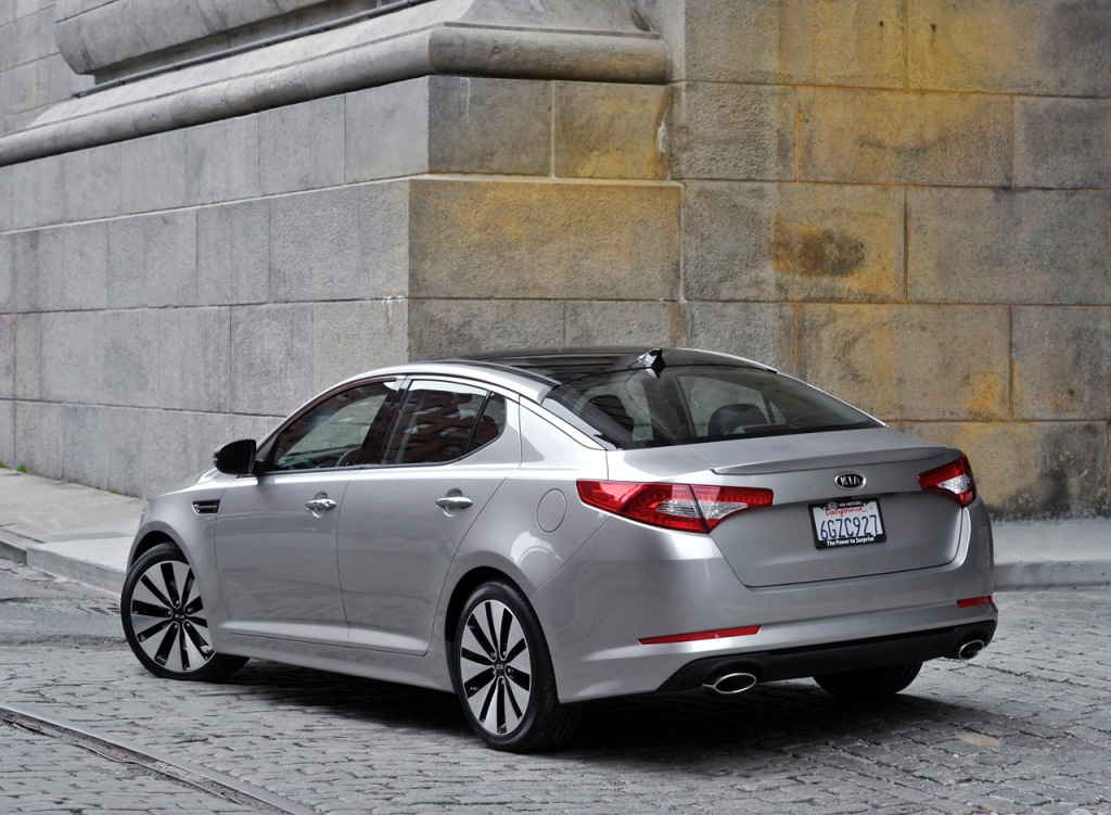
The rear, for its part, is nicely tailored and reminiscent of the very handsome Kia Optima’s. It’s also thankfully free of any trinkets and extraneous ornamentation that would quickly date the car; as a result, I have a feeling the shape will seem fresh for quite some time.

2014 New Mazda 6 Six Interior Inside Cockpit Console Dash Dashboard

The interior is spectacularly well done. It features a meaty 3-spoke wheel, pleasing lighting and detailing and a neatly laid out center stack with actual grasp-it knobs flanking the multifunction screen. I don’t think it’s overstating the case to call the new 6’s interior Audi-esque, and ’round these parts, cabin styling accolades don’t get any higher than that.

With the shape spot-on, the only potential cause for concern is the output of the engines Mazda plans to offer under the new 6’s hood. The aforementioned CX-5 won the recent Car and Driver comparo on the basis of its chassis dynamics; speed-wise it ranked dead last among its competitors. Mazda has an unfortunate history of creating brilliant-driving, yet underpowered cars, and here’s hoping the new 6 bucks that tendency. I will say things don’t look so rosy at the moment: The only engine available with a 6-speed manual is a 2.0l, 148 hp 4-cylinder. The new 6 would have to be made of feathers and aerogel for that kind of output to be able to move it at a respectable pace. There will be a 189-hp 4-cylinder option, still a rather pathetic number nowadays, but sadly it looks as though the stronger engine will only be mated to a slushbox.

If styling and cornering acumen alone were enough to secure the top spot in the hotly-contested midsize segment, I’d say Mazda hits the bulleye with their new 6. Let’s just hope the automaker’s engine choices don’t let down the rest of the car.

8 Comments on New 2014 Mazda 6 Looks Brilliant

The Aesthetics of Racing: Ford GT40

August 8, 2012 by Matt

Ford GT40 Mark II 2 Gulf Racing

Pure function can be brutally attractive.

Even though its profile changed in detail between its four incarnations, whatever specific shape it took, the legendary Ford GT40 epitomizes the function-as-form racer aesthetic.

The Mark I and II shape, shown above, remains the most well-known GT40 variation. The car’s genesis is familiar to most car buffs: After an aborted attempt to buy Ferrari outright, a racing-victory-hungry Henry Ford II decided to build his own Ferrari beater, and after a few years of working out the kinks, scored 4 straight 24 Hours of Le Mans victories from 1966 through 1969. The body of the 427-powered Mark II, which delivered the first Le Mans victory in 1966, was a British-based Lola creation, so it was technically an Anglo-American car. Still, whoever made it, the GT40’s design is absolutely arresting (especially for the mid-’60s), devoid of anything that would compromise its singular mission. There were no wings, no frills, no fancy multi-cam V12s—just brute American pushrod force to complement the stubby, blue-collar shape.

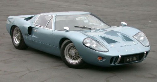
Ford GT40 Mark III 3 Road Car Blue Gray Grey

With the Mark III, shown above, Ford civilized the GT40 just a bit for road use. It’s a tribute to the basic appeal of the car’s proportions that the only major external changes came in the form of different headlight clusters and a slightly lengthened tail for additional storage. A contemporary of the groundbreaking Lamborghini Miura (the first mid-engined supercar), the GT40’s dynamics and racing pedigree easily trumped the Italian exotic’s. Sadly, only 7 were made.

Ford GT40 Mark IV 4

The wholly made-in-America Mark IV was a substantially different beast. Even though it retained the same overall look and feel as its predecessors, much of its aesthetic appeal was sacrificed in the name of additional aerodynamic refinement. Dispensing with the Lola-designed bodywork, Ford brought the design in-house, tweaking and refining the basic theme. The Mark IV kept the GT40’s signature stubby shape, and delivered the only true all-American Le Mans victory, driven by the all-star pairing of Dan Gurney and A. J. Foyt in 1967.

I don’t know that there’s even been a car quite as effective looking as the GT40. Delicate F1 racers and more modern endurance machines are typically festooned and underpinned with far more sophistication, but the results seem to be cars that politely ask the elements (air, road surface, etc) to cooperate. The GT40, on the other hand, commands respect; its shape demands compliance from its partners in victory. It gets the job done, not glamorously, but effectively, and there’s an undeniable beauty in that.

Editor’s note: This post is part of a series examining the aesthetic merits of cars designed almost wholly with function in mind. Read the other installments here:

7 Comments on The Aesthetics of Racing: Ford GT40

Styling Misfires: The Chrysler 300M

July 29, 2012 by Matt

Chrysler 300M Silver Gray Grey

This truly is a case of the Emperor’s New Clothes. Astonishingly, the Chrysler 300M was Motor Trend‘s 1999 Car of the Year and placed in the coveted Car and Driver 10 Best for both 1999 and 2000.

I have one question: Did they look at it? If they did, what other explanation could there be for the accolades it earned? Were the editors paid off by the automaker’s marketing department? Or was there some other reason for the peer pressure that seems to have prevented them from calling Chrysler on their styling disaster?

Chrysler 300M Black

Mercifully, the car was only with us for 6 years, from 1999 to 2004. An example of Chrysler’s “cab forward” platform architecture, the 300M’s front wheels were powered by a 255-hp V6. Billed as a sports sedan and formulated in large part for the European market, its handling, power and interior space were by all accounts respectable.

But for heaven’s sake, just look at it. The 300M’s length was reduced for more size-conscious European sensibilities by simply lopping the end off the trunk, creating a massive disconnect with the rounded lines everywhere else on the car. The overall proportions are blobby and distended, and the nose, oh the nose. The car’s fascia seems more like a random collection of shapes sprayed onto the front bumper with no relationship whatsoever to each other. It’s just a disaster.

So the question remains: Why on earth did no automotive journalist pipe up and topple Chrysler’s stylistic house of cards? I suppose we’ll never know.

Editor’s note: This post is part of an ongoing series wherein I discuss unsuccessful cars whose styling was their overlooked (or denied) Achilles heel. Read the other installments here:

9 Comments on Styling Misfires: The Chrysler 300M