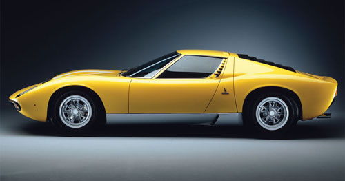
Design Highs and Lows: Bertone

The great car designers and styling houses have produced their share of automotive art. They’ve also penned some designs that left the critics and viewing public scratching their heads. Today we begin a new series highlighting, per post, one example of notably excellent and one case of notoriously questionable styling from individual designers and firms.
Perhaps no Italian automotive design concern has allied itself with a wider range of clients than Bertone, based in Turin. Over the years, from Abarth to Volvo, they’ve earned their keep by shaping some achingly lovely sheetmetal. Their first design for Lamborghini, with whom they’ve enjoyed a long and productive relationship, is arguably Bertone’s finest shape. The ’67-’72 Miura mid-engined supercar, shown at top, was the work of a 25-year-old quasi-prodigy named Marcello Gandini, who got it right in almost every respect, from the wildly provocative—but not gaudy—proportions emphasizing the transverse orientation of its V12, to details like the post-window vents and rocker panel scoops. Simultaneously expressive and tasteful, it’s a design tour de force.
On the other side of the ledger, we have the car shown below, the ’78-’81 Volvo 262C:

For this exercise, Bertone took the already-frumpy shape of the Volvo 240 coupe and pushed it full-tilt into pure ’70s camp. Everything below the greenhouse was essentially left untouched, the roof was lowered a few inches and the windshield raked—and that’s it. The upright C-pillar and other superficial similarities to American luxoboats of the era aren’t coincidental; allegedly, it was Volvo’s attempt to wedge themselves into that market niche by tailoring their 240 to our tastes. Fortunately, even if we kept buying our tacky American land yachts, we had the good sense to see through such a half-baked marketing ploy, and the 262C met a cool reception. Bertone later tried to disavow their hand in the car’s design, claiming they had only built the car, not penned its lines. Sorry guys, you’re stuck with it. At least you have dozens of superb designs to balance it out.
Editor’s note: This post is part of an ongoing series where I highlight one example of both excellent and awful design from a noted styling house or designer. Read the other installments here:
View all posts in this series
- Design Highs and Lows: Bertone
- Design Highs and Lows: William Towns - November 2, 2011
- Design Highs and Lows:
Ferrari + Pininfarina - November 16, 2011

Wow. Volvo played Mad Libs with a Ford LTD.
They sort of made up for it with the flat hood a couple years later.
Hahaha. Well put. :)
They certainly did make up for it with the Flathood! One of my favorite Volvos ever.
The storied Italian design houses, Bertone, and Zagato, relied upon their initial founders for their best work. When the founders died off it seems they had failed to groom the talent that would have known how to produce striking lines without “striking OUT.” Today we see the surviving houses simply recruiting the recent Art Center (California) graduates, who often as not are Orientals. or females, far far it seems from any in-house acculturation. I didn’t need the Pope to be Italian, and I don’t to disparage these either, but couldn’t the houses have developed these as their own talent in their own corporate cultures? Before immediately entrusting them with their first assignment as an important commission? What happens with the Art Center alumni is that everybody is now aware of what everyone else had been doing as their theses, and will probably continue to do for their new employers. Looking over everyone else’s shoulder is NOT the way to discover freshness and provide new drama. Beyond a need to know the mechanics of the trade, how to draw, sculpt clay, and even to understand the Reynolds Number in the wind tunnel, but how about some native genius and daring being rewarded?
Point taken. I agree in the sense that top-level designers shouldn’t be as “interchangeable” as they seem to be. In other words, I’ve no problem with Pininfarina, for instance, plucking an Art Center grad, but for heaven’s sake hold on to him/her and build or make sure he/she has a connection with the brand’s aesthetic legacy, rather than simply being able to produce attractive, if inert designs. Less “modularity,” in other words.
You could have opposed the wonderful Miura with that prototype Transformer device I’ve always called “the Count Ouch” and had as convincing case for an “off day at the job.” Both presumably Gandini oevres.
Hmm; not familiar with that one. Will have to track it down.
I refer of course to the Countach, which was not so grotesque as originally conceived, at least for a mid engined shape, but required numerous scoops and excresences before it could operate without overheating.
Hahaha
I should’ve caught that one—well played. :)
I’ve no problem with the Countach; at least, as you say, not with the original, more “pure” iteration. And even the ’80s versions I give a pass for the simple reason that a poster of a white one was my wall centerpiece for the better part of 10 years growing up.
When do we get to know more about Matt himself? Is there a trackback to Linkd In?
My digital footprint is pretty small, but if you’d like to know more, you’re welcome to drop me a line via the Contact link at the top of the page. :)
Matt, and anyone reading here are welcome to visit my facebook page called Looking Back Racing for discussions of the same nature as found here. I am busy loading what I started last month of several years of design sketches done for no particular reason.